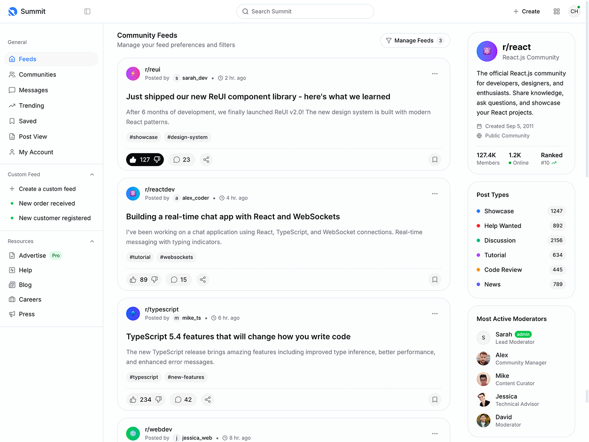
The side menu does not work when running from a mobile device ReactJs ver 8.1.9
side menu does not work when running from a mobile device and also have scroll bar not appear some cases .I think issue related with fixed height. I just tried following way on SidebarMenu component
<div
style={{overflowY: 'scroll',height:580}}
className='menu menu-column menu-rounded menu-sub-indention px-3 dynamic-menu'
id='#kt_app_sidebar_menu'
data-kt-menu='true'
data-kt-menu-expand='false'
>
its working on larger screen devices.
Replies (48)
by making these adjustments to your SidebarMenu component's styling, you should be able to resolve the issues with the side menu on mobile devices and ensure a smoother user experience across different screen sizes.
M. Yo at Sydney audio visual consultant
The responsiveness of the side menu in the ReactJS version is impressive! Despite encountering a minor issue, the overall functionality and design show great promise for seamless navigation on mobile devices.
Got the solution,open simple side menu package.json, then replace react-router-dom older version with latest one.that's it.  - Web Lint
Round the World Camping your ultimate destination for outdoor adventures! Embrace the great outdoors with our high-quality camping gear and expert tips. Round The World
Round the World Camping your ultimate destination for outdoor adventures! Embrace the great outdoors with our high-quality camping gear and expert tips.
Round The World
I gained a lot of knowledge from reading your site nytimes crossword, and if you want to have more interesting experiences, you should educate yourself on previous video games. Playing with you in the past is something I am looking forward to!
It seems like the issue with the side menu not working on mobile devices and the scrollbar not appearing may be related to the fixed height set for the menu container. You could try using a responsive approach for setting the height of the menu container, such as using percentage values or media queries to adjust the height based on the screen size. Additionally, ensure that the CSS styles and JavaScript functionality are properly implemented for mobile compatibility.
C.J., roof repairs Sydney
Your invitation is very attractive, I'm only interested in downloading and playing minecraft game at
You might have to modify the design and arrangement of the menu tiny fishing to better suit smaller screens.
Ensure that your sidebar menu component is designed to be responsive, meaning it adapts to different screen sizes and orientations. You may need to adjust the styling and layout of the menu to better accommodate smaller screens. By addressing these considerations and implementing responsive design techniques, you can improve the functionality and usability of the sidebar menu on mobile devices in your React.js application.
kim h. - Sydney food truck
Hi,
Thank you for reaching out to us.
Can you let us know which demo you are using?
Please be aware that on the mobile version, you need to tap the sidebar toggle button in the mobile header to view the sidebar.
Regards,
Lauris Stepanovs,
Keenthemes Support Team


