


Publish your color palette
In previous versions of Metronic you included a Color Palette page within the Demos. This would be very helpful to be able to see the colors all in one place. In particular, a number of the colors for buttons both for normal and hover state are not WCAG Accessible because the contrast is too low. Having a demo page would make this easier to test our customizations.
Replies (213)

I'm in complete agreement that a palette page is important for easy customization, but even more so for checking hover colors and the colors of various elements in relation to one another. The palette is also good for judging WCAG contrast levels before going live.
For me, it makes sense to collect a range of site examples, paying attention to their use of color, font and the overall appearance of their design. As an example of a site that does this really well, one of my favorite examples is Godrej Park Regent where you can see the mixture of different colors and font combinations while analyzing how all elements of the site's design interact with one another.

When developing dashboards or responsive websites, I find it helpful to study real-world implementations instead of relying only on design mockups. Prestige Kompally Observing navigation patterns, spacing, typography, and responsive layouts often reveals practical ideas that can improve usability. I keep a small collection of public websites that showcase different approaches to content organization and page structure. One example is Prestige Kompally Amenities, which I recently bookmarked while comparing responsive layouts and landing page sections. It's useful as a design reference rather than as a template to copy. Looking at a variety of live websites helps identify effective UI patterns, accessibility improvements, and layout decisions that can be adapted to different projects while maintaining original code and design principles.
Book a professional safe driver Dubai or a luxury car with an expert driver service. Enjoy convenient, dependable and safe travel with Safe Driver UAE.
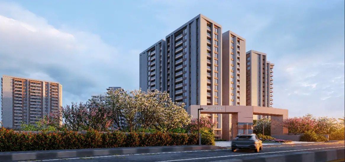
Sobha Sacred Grove by the Lake is a luxury plotted township in Chikkathirupathi, Malur near East Bangalore. It offers premium residential plots, quality amenities, smart infrastructure, and modern planning in a peaceful green environment.

Awesome site you have here but I was curious if you knew of any discussion boards that cover the same topics talked about here? I’d really love to be a part of community where I can get comments from other knowledgeable people that share the same interest.

Students often wonder how <a href= detect cheating</a>, as the system tracks answer patterns, timing, and login activity. These detection methods make dishonest approaches risky, encouraging learners to rely on genuine effort and proper help.
Many students search for<a href= to cheat on WeBWorK</a> , but most methods are unreliable and easily detected. Instead of risking penalties, focusing on understanding concepts and using legitimate academic support is a safer and smarter approach.
This guide on how to <a href= on McGraw Hill Connect</a> is really helpful for students struggling with difficult assignments and timed quizzes. The tips and explanations make it easier to understand how the system works and how to manage Connect tasks more effectively.

Mahindra Beacon Hill G+60 tower stands on a two-acre parcel and houses just over 240 residences, giving the project a sense of space and privacy that is rare in this part of the city. Homes come in 3, 3.5 and 4 BHK layouts, each planned to capture natural light, sea breezes, and sweeping skyline views.
The Sobha Hoskote project is an upcoming residential development in East Bangalore designed for modern urban living. It focuses on spacious apartments, quality construction and lifestyle amenities. The Sobha Hoskote Location is gaining attention due to improving infrastructure and connectivity to Whitefield and KR Puram, making it suitable for both end users and investors.

I have been looking for articles on these topics for a long time.I don’t know เว็บà¹à¸—่งบà¸à¸¥ how grateful you are for posting on this topic. Thank you for the numerous articles on this site, I will subscribe to those links in my bookmarks and visit them often. Have a nice day.

The Defenders Security & Allied Services, a fully integrated Best security agency in Gurgaon Solutions and Facility Management Company in Gurgaon, is part of a large conglomerate with more than INR 5000 crores of assets under management, dealing with , Industrial security in Gurgaon & Residential Security Gurgaon, Event Security Gurgaon, Corporate Security Gurgaon Facility Management. We are also known for Security guard company in Gurgaon, housekeeping services in gurgaon.
This was my first blog on your website. I would like to say that the quality of the content is up to mark. Thanks a lot for sharing this. I will surely read all the blogs from now.

Digital Marketing Company In Punjab, Digital Marketing Company in Gurgaon
Vishyat Technologies is one of the best Digital Marketing and Digital Marketing company in Chandigarh. We have helped a lot of businesses get better online exposure. Digital Marketing Company in Amritsar. Vishyat Technologies offers Digital Marketing Course in Zirakpur, Digital Marketing Company in Mohali. Website development, SEO, PPC, Backlink Building, Digital Marketing Company in Zirakpur Content Development, Content Marketing, Conversion Rate Optimization, Email Marketing, Online Reputation Management, Digital Marketing Company in Faridabad, Digital Marketing Company in Noida, Brand Reputation Management, Hospital Reputation Management, Web Analytics and Internet Marketing. Vishyat Technologies optimises your site, with or set up an extensive social media presence for you. We offer great quality content for your website and effective social media marketing campaigns. We also offer SEO Reseller services or SEO Outsourcing services to our clients in US, UK, Australia
Informative and well-written! I appreciate you sharing this. Looking forward to more insights on this subject. Visits www.centurymiraimarathalli.in

Purva Arbor is an exclusive plotted development by Puravankara Group, located in North Bangalore near Yelahanka–Doddaballapur Highway (NH 648). Spread across 9 acres, Purva Arbor offers over 100 premium plots ranging from 1,000 to 2,500 sq. ft. Designed for modern living, Purva Arbor features landscaped gardens, a clubhouse, swimming pool, and secure gated access. With excellent connectivity to IT hubs, schools, and the airport, Purva Arbor blends comfort, luxury, and convenience.
ref:

The color palette could play an important role in setting the tone and mood of any space. Soft neutrals might bring calmness, while bold shades could add energy and character. When choosing colors, a sense of balance and harmony might create a pleasing effect throughout the room. With thoughtful renovation tips , there’s a possibility that the right color palette enhances both style and comfort, giving the home a refreshing and inviting atmosphere.

We are offering you a variety of pedicure treatments like kids massage; best places for couple massages for your beautiful feet Aira Spa and wellness center are providing you a different type of services like Massage Airdrie Spa Airdrie, is the best registered massage therapy near me. and also help them stay healthy all year long. We use the best beauty product for our customer's glowing skin. Acupuncture Airdrie uses super-efficient nail salon in Airdrie mediceutical products to perform Threading Waxing in Airdrie, pedicure with its proven healing properties, and its intense relaxation qualities, Eyebrow Microblading in Airdrie, this fabulous range of products have been formulated with specific podiatry needs in mind. We also provide spa packages to your complete satisfaction with Facial Airdrie. We offer massage therapy with direct billing. You can contact us for your needs and requirements and also book our appointment for a better experience. Botox airdrie is one of the services used by many women, it is an effective and amazing way to combat one of the most common signs of aging that is wrinkles. Varicose vein therapy is also offered by us. Best Botox Airdrie can be used to reduce your worry lines in the forehead, wrinkle between the eyebrows, smile and laugh lines and also crow’s feet. Bioflex laser Airdrie.

Sattva Hamlet in chikklaja Road, Bangalore. The 3460 units are spread out over 28 acres and include 1, 2, and 3 BHK flats. Phase 1 has 17 buildings with 2B+G+19 stories spread out over 53 acres. Along with apartments, the Sattva Group’s new Whitefield project has other parts. visit : <a href= Hamlet</a>