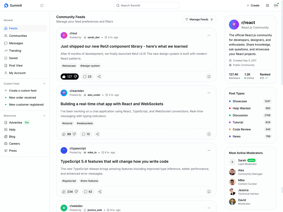
Sidebar and header doesn't get sticked to top and cannot scroll vertically inside of the sidebar menu
On the following page, I hope the sidebar and header section get sticked to the top on scrolling.
And on tablet device like iPad, after expanding the sidebar with tapping the arrow button on the top left, I cannot collapse the menu with tapping the same button. How can I fix this?
Condition:
Product - Medtronic
Language - HTML
Purchased via Themeforest
Hope someone could help fixing this issue. Thanks!
Replies (1)
Hi,
Please add data-kt-app-sidebar-push-toolbar="true", data-kt-app-sidebar-fixed="true" and data-kt-app-header-fixed="true" attributes to the body tag.
Also please change the wrapper class to app-wrapper in your HTML layouts.
Just a reminder. Please note that one license allows using Metronic for a single deployment and all subsequent usage requires a separate license. Also please do not share your purchase code with the public. I removed it for now. Users may use it to download Metronic for free.
Regards.


