


Excessive horizontal padding in the main Container — how to make the layout use full width (sidebar expanded/collapsed)?
Hello Metronic team,
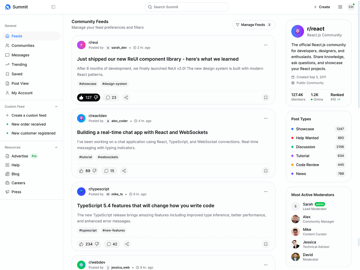
I’ve noticed that in the dashboard layout, there is a large amount of unused horizontal space between the sidebar and the right edge of the screen (see screenshots attached with yellow arrows).
It seems that this space comes from a common Container component that limits the width of the main content area.
Even when the sidebar is collapsed, the main content doesn’t expand — it stays centered with large side paddings.
My questions:
Is there a recommended way to reduce this padding or make the layout more fluid (full-width) while keeping the responsive design intact?
Is Metronic planning an update or configuration option for this in a future release (e.g., a “fluid container” or “wide layout” mode)?
Thanks for your help and great work on the template!

Replies (3)
Good point about the extra padding—switching to container-fluid is definitely the simplest fix if you want full-width layout. I had a similar UI spacing issue while working on MB WhatsApp, and removing default padding made a huge difference in how clean the interface felt. Sometimes it’s the small layout tweaks that improve the whole user experience.

Hi,
In the code please change "container" class to "container-fluid" class for all components(header, wrapper, etc) to fully occupy the available page width.
If you need any further help please do let us know.
Regards,
Sean
Hi,
Sorry for the late reply. Could you please provide us with more details ? Which Metronic version are you referring to ?
Regards,
Sean